At Conversionista, we have developed a tool that helps you evaluate your most popular and important landing pages. That is, the pages on your site where visitors usually make decisions regarding if they are going to stay on the site, keep clicking through, sign up or purchase a product.
As you know, we are using a conversion model in our conversion optimization work, and the factors that we evaluate with this tool come from this model. We also use persuasion principles deeply rooted within the field of psychology, which are extra important when we talk about hero images, headlines and subheadings and call to actions. That is, what your visitors see first when they land on your site.
Let us present: Landing Page Evaluator
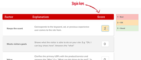
The seven factors included in the “Landing page evaluator” are graded on a scale with three steps, from bad to good.
1Search term check up :
Do the search terms, ads or previous experiences that led the visitors to the site correspond with what they expect to see?
2Meeting the visitors’ goal:
Clarifies what the visitors can do on/get out of the site. For example, “Oh, here I can buy chairs!” answers the “what”.
3Readability:
Good readability in regards to the font, font size, color contrasts etc. For example, don’t put light gray text on a gray background, or use 10px font size.
4Value proposition:
What kind of value does the site give the visitor? What are your USPs? This factor aims to answer the “why”; for example “What can this product do for me?”.
5Emotional proposition:
How will the site change the visitors’ feelings in a positive way through motivation and/or through removing friction? For example, widely recognized factors such as loss aversion, temptation, discount, social proof etc. Tip: Find out what your visitors feel towards your product and use it to your advantage.
6Short and concise:
Is the message that you would most like to convey the first text that the visitor reads? Convey what you want to convey in the shortest text possible, be specific! Hint: Walls of text are very difficult to read.
7Tonality:
The imagery and text should speak the language of the visitors and target groups. For example, if you use many unnecessarily complicated words, your visitors are more prone to misinterpret your message and who you are.
Keep reading to discover how Telia used this tool to increase their CTR with 60 %
*CTR = Click trough rate = the number of users that click through to your site.
During 2016, Telia launched a campaign with advantageous mobile surf offers. Our job was to evaluate the campaign site and suggest improvements that would increase conversions. Together with one of Telia’s employees, we used the tool as a first step to evaluate how the landing page could be improved.
This is what the original page looked like, which got a 9/18 score (this version of the tool only had six factors):

The purpose of evaluating a landing page using this tool is to get a clear view of what can be improved, but also to have something to show your bosses to prove that you need more authority to influence your company’s most important landing pages, instead of these pages containing the regular corporate bullshit.
As you see, we could identify factors that clearly needed improvement, especially those regarding clarity, emotional proposition and the presentation of the value proposition.
Telia’s designers got to work and delivered this result, which received a score of 17/18:

Of course, all factors are not equally important when it comes to motivating a visitor to do a certain action. If you get a perfect score on readability, but fail to communicate the value proposition or raising emotion in your visitors, why would it matter that they can read your text?
Here are the two versions next to each other:

The result and how it was measured
Because of different limitations we could not A/B test the new design against the original. We were instead forced to use emergency method #1, a so called 1 / 2 test, which means that we basically measured the page’s click through rate from a period of time when the original page was displayed with a period of time when the new version was displayed instead.
The result was a 60 % increase in CTR from the landing page to one page closer to conversion. Regrettably, we could not measure through conversions either in this case, which we always recommend if possible.
Now it’s time for you to improve your landing pages!
So, do you feel ready to start optimizing your landing pages? Good! Choose your most popular or important landing page and start evaluating it with this model. Once you’ve done that the hard part begins: to actually improve it.

If any questions pop up regarding how to use the tool, or if one of the factors are unclear to you, please contact [email protected] and/or [email protected]. We will answer as soon as possible.