We all have them on our websites to get customers or leads and we all have been frustrated by filling them out. Web forms. The looooong, energy and time consuming web forms. Let’s make them nice, smooth – and converting!
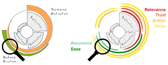
Optimizing web forms is primarily about reducing friction and making the forms more intuitive. It can be derived from our method on where in the customer journey you want to increase motivation and where to decrease friction.
Web forms are often found in later stages of customer journey, closer to “commitment” phase – when you actually make a decision to act:
In this post we list 10 tips on how you can review and optimize your web forms primarily to reduce friction for your visitors. It is by focusing on simplifying, inspiring confidence, making the action clear and illustrating the value.
You will also get a mobile bonus at the end of the post (hang in there). Here are the tips!
1 Have as few fields as possible
Web forms should never get the visitor to ask “is providing this information necessary?” In part, we become unsure when we are asked to hand over personal information if we do not understand how it will be used. But above all, we become bored and do not finish what we started – in a situation where we stumble right before completing what we originally had the intention to do (that is, convert).
A typical example comes from when we were working with the insurance company Skandia (insurance forms are snoozing, as you may well know). We asked the question “Do we really need all this information? Do you even check on it?”. After a few conversations with attorneys it turned out that no, the information was not needed… Of course, other changes were made, but optimisation of the web form was a contributing factor to 222% increase in signups for insurance.
A number of other cases confirm that fewer fields in a web form can lead to more conversions.
 Blivakker.no removed 3 of their 17 (!) form field that they did not really need, and the number of registrations increased by 11%.
Or, as this airline that during a test reduced the number of fields to the minimum necessary which increased the number of visitors who went to the next step by 45% and the number of form submissions by whole 35%:
Remember not to ask for things you do not really need.
- Do not ask for the address if you do not intent to send anything.
- If you need to ask for personal information, describe why you need it and how it will be used, for example, “We need your phone number to send a text message when you can pick up your package.”
- Look over the fields that are not required. Do non-mandatory fields need to be there?
- Consider if it is appropriate to collect information in some of the fields at a later stage.
The next step is to open the form with the easiest field to complete in order to “warm up” the user, and then gradually increase the complexity.
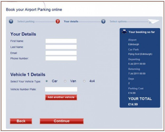
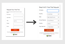
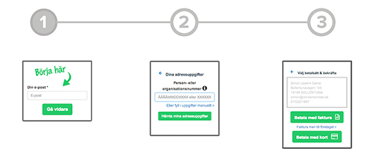
2 Break down long web forms in several steps
In cases when you actually need to have a long form (we’re looking at you, insurance companies), be creative and get the web forms feel short. Should we trick the visitors? No, but:
- By gradually engaging, the user will have the motivation and the positive feeling of “almost there”. And the feeling of “I do not want to quit because then I have unnecessarily started”.
- You can also use a progress bar to visualize how many steps are completed, and how many are left.
The SaaS-company below wanted to get more people to sign up for a demo of their software. They moved the fields for corporate information to a separate step, and the result? 30 % more signups.
We conducted an experiment with Dagens Industri, where we worked specifically with gradual commitment and a progress bar. The change resulted in 29% increase in conversions (and a 67% reduction of bounce rate). (Read more about this case here).
Save what you have completed
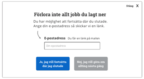
Visitors who begin to fill in the form but not complete it, what can you do for them?
Well, you can save the web form for later.
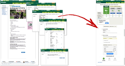
Especially with web forms that have several steps: you can save the values already filled in and give the visitor the choice to return to complete the form (in case he or she leaves). It is particularly useful for long applications, ad creation and so on. This is an example we made for one of our customers:
3Use the directional and visual cues to guide the user
So called “Directional cues” are the elements aimed to call attention to another element of the page. They can be used to direct the focus to the first field, to guide the user to start filling in the form. “Visual cues” can be used to guide the user forward/downward and further into the form.
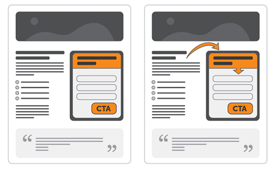
Footnote: You want ONE clear action per page. If the web form is not your main action on a specific page, you should not outcompete something else by drawing attention to the form.
With the help of eyetracking ConversionXL could in this test see how different shaped directional cues influenced the interaction with the form.
![]()
The version with a hand-drawn arrow toward the first field made the most to focus on the form instead of the text. It also appeared that those, who were exposed to the arrows during the test, in retrospect remembered the web form and knew how they would go about contacting the company during the visit.
Takeaway: Directional cues help the user to see – and faces work worse than arrows (in this case).
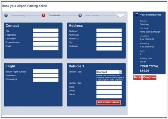
4Avoid multiple columns
The form fields should follow a vertical flow. Multiple columns break the visitors’ vertical momentum to move downward in the form.
 Use a column to avoid the situations when users perceive fields inconsistent and misunderstand how fields relate to each other. The following picture shows 5 different ways to interpret the order of two columns:
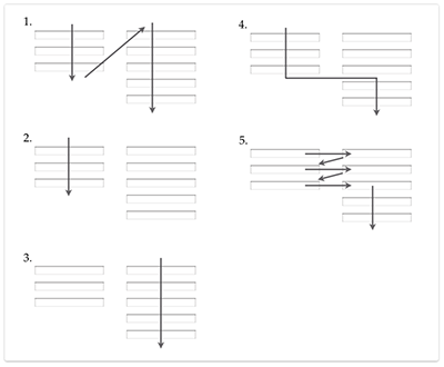
Do not assume that the visitors understand how the form fits together, just because you make it. Check, for example, this usability test (as well as the video below, 1:10 in) where the visitor began to fill in the information in the first column as if he or she already had the login, then proceeded to column two despite a seemingly clear “OR” between them. Only when the user comes down to “email” in column two, the user realizes that “I have already filled this in” and that the first column was filled unnecessarily.
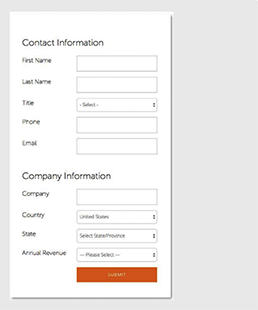
5Location of field titles
You can place your field title (label) in various ways, and we will show why the above (top alignment) or inside (infield top aligned) is recommended.
We check a usability test performed by Agnieszka (Aga) Bojko och Robert M. Schumacher. The study tested five alternate field title placements:
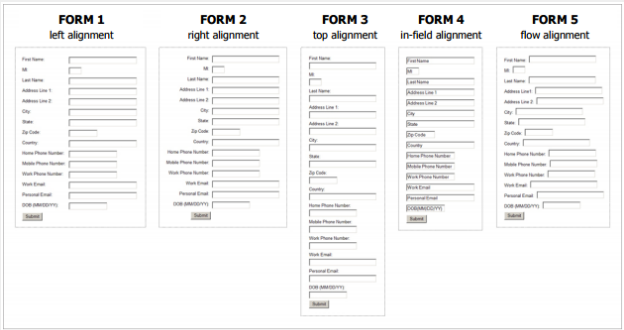
The results showed no significant difference in time to complete the form, BUT:
- Variation 3 (above) appeared to be most effective as it had the least number of corrections (i.e. good visual scan).
- Variations 1 and 2 were perceived as relatively easy to complete (we show below, however, why the efficiency is worse here than when you have the title above), while Variation 4 with labels inside the fields was perceived as difficult. Later in the article we will describe how to place the title inside effectively.
- It was confirmed in test that variations 4 and 5 had lower perceived satisfaction, low efficiency for scanning and for variation 4 also difficulties in processing the form.
Title above
We noted the importance of the title to be close to the form field to avoid any confusion about which title belongs to which field as well as to minimize the number of interactions. In other words, the reason why above is better than at the side is:

Title inside but above writing area
When you place the field title inside the field, the visitors will overwrite the title when filling in the field. The solution may seem clever in that you save space and reduce the length of the form … But it may cause a clear dissatisfaction when the user receives an error message and needs to change the text without being able to see what should be in the respective fields …
The solution is to use something called “Float Label Pattern” in such cases. That is, when you begin writing, the title moves up.
Or, placing the title directly in the field, but above the area where you write.
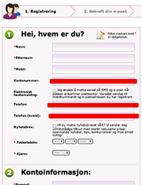
6 Use smart web forms
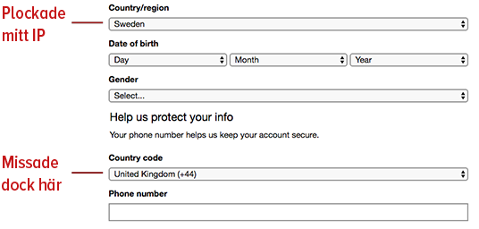
By placing cookies on already identified users, you can either pre-fill the information you already know or simply not ask for it again. But in some situations, it is better to be transparent about you actually knowing who the user is (i.e., by showing pre-populated fields).
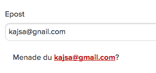
You can also make use of known data to figure out other information. For example, if the visitor enters the address, you can figure out the city. If the visitor enters the country, you can figure out the code for the phone number.
Microsoft is halfway home:
We ourselves use this function in the form for sign-ups to our course Conversion Manager. When you write your e-mail address, we pick up the (presumed) name of the person.
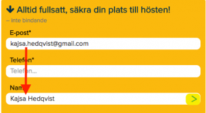
Our contact form works the same way (test below!):
_Kontakta oss (footer)
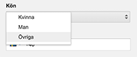
7 Dropdowns – Use them correctly
Using dropdown menus to select responses is something that often occurs in the web forms today, but do not assume that everyone knows what to do with a dropdown (in the same way as one should not assume that everyone can scroll …).
 Formisimo shows this in a case of a form where 65% of those dropping off the form made it from a dropdown box. Presumably the problem is that the dropdown menus hide information that must be unpacked and sorted by the user in order to find the right answer.
Dropdowns can, nevertheless, be good if used correctly. A guideline to use is that it often is a great feature for 7 to 15 answer alternatives.
It can, however, lead to poor user experience, if used for too many or too few response options.
Too many response options
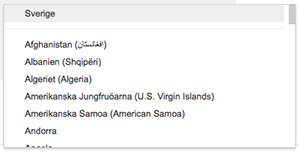 If you have a dropdown with too many choices, it becomes difficult for the user to scan and navigate through them. You have to scroll which leads to poor experience and oversight. A classic example of this is choosing home country for delivery.
Problems that may arise:
- Long scrolling due to alphabetic order
- When you get to “Swe”, you realize that the very alternative was located at the top of the list as the most common option
You know your country, so use the text fields with auto-complete instead.
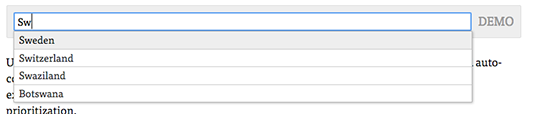
Baymard has done a demo on what they think is a good option just for a country-selector, try this here.
Too few response options
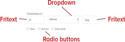
When the dropdown menus have fewer than 7 options, they suffer from a “lack of up-front information”. Instead of two interactions (click to see + click to select), a better solution would be to see all the options directly in the form of:
- Radio buttons (check your choice)
- Buttons (click on your choice)

See more great tips on how to avoid the drop downs here.
Dropdown menus HAVE nevertheless a place in web design. Always think of what information you are trying to get through your dropdown. Consider also whether there are more suitable alternatives, such as text fields with auto-complete or radio buttons.
Spotify has got it:
A good way to increase usability is to make it possible to interact with dropdowns from keyboard. The up and down arrows to navigate and enter to choose the right option.
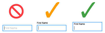
8 Positive validation

An effective method to motivate the user to continue filling out your web forms is positive reinforcement for completed fields. See here why checkmarks & trestles convert.
To assure the user that he or she is about to do something good, you can add the following to the form:
-
- Social proofs
USPs
Assurance to prevent the user from feelling insecure, for example, by explaining why the information they provide is needed and that it is in safe hands
A link to the policy concerning personal data may in some cases be a good idea
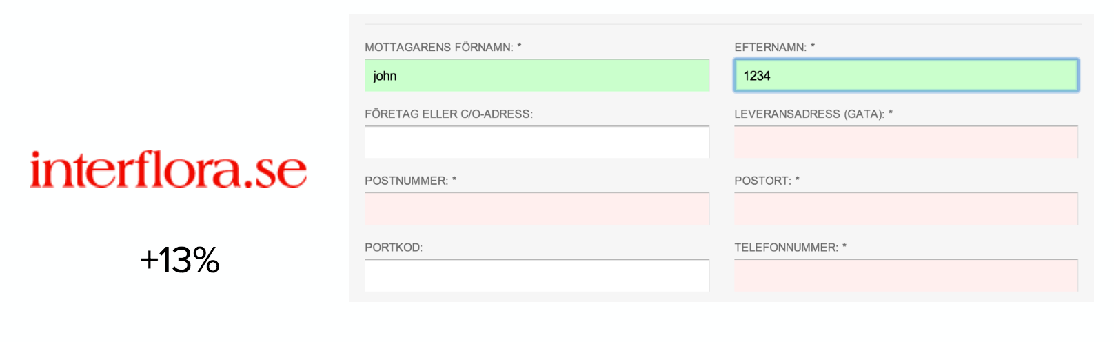
Interflora in a simple experiment started to give positive validation to the user by making form fields green when completed, which resulted in 13% increase in conversion.
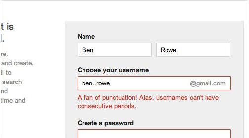
9 Reduce friction with the right error messages
Shit happens. Things go wrong sometimes when users fill in your web forms. Errors create frictions for the users, regardless of whose fault it is. So what can we do to reduce friction here?
Make sure that you:
- Use positive and motivating words and avoid accusatory and negative-sounding ones like “must”, “wrong” and “invalid”. Put the blame on yourself and not on the user
- Have custom error messages for each field, such as “there is no @ in your e-mail address”
- Add the message BY the field with the error
- Make sure to show all the error messages simultaneously if several fields were filled incorrectly. In order not to “trick” the user that he/she is good to go after they corrected only the first error that appeared
- Make sure that the user does not need to start from scratch if something went wrong
- Identify common misspellings
The best error message is the one that never shows up – Thomas Fuchs
Psst… For the daring! Use humor in your error messages to lighten up the mood of the otherwise frustrated moment. However, be careful and choose your spots right! For example, as Gmail and Yahoo do here!

10 Motivate with right CTA
The CTA on the button used to submit the form is important not only for the progress, it also motivates the user to initiate and complete.
The message here should:
- be short
- contain an action verb
- be specific and confirm the value
According to Janne Wibe, the CTA text should always speak personally to the user and include I-form instead of you-form.
A good CTA has the following form:
“I want_______”
/Joanna Wiebe, Copyhackers
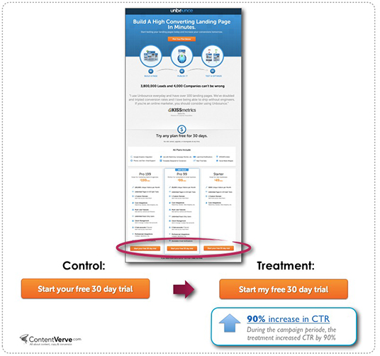
This has also been tested by Michael Aagaard, who increased the number of clicks by 90 % after replacing the “start your subscription” by “start my subscription”:
Simply using an action, such as “start now” or “subscribe”, does not show the value and potential pain points. Your CTA should confirm the value that converting users get from you. An experiment, that Empire Flippers did, proves the point: “Make Money Flipping Websites” converts by 33% better than “Join us”.
 ConversionXL has a further example here.
Also make sure that CTAs are clear and isolated in their position so that there is no doubt about where to click. For the sake of motivation, make sure to demonstrate the value and what happens (where the visitor is directed) after the click. This makes it easier to visualize where you end up when you’re done.
Mobile specifics
The experience of filling in web forms on mobile differs a lot from the desktop. With today’s increase in mobile traffic, it is important to adapt and optimize web forms specifically for mobile use.
We will therefore return with a separate post specifically for mobile. The principles are the same, simply a smaller surface.
Some things to consider:
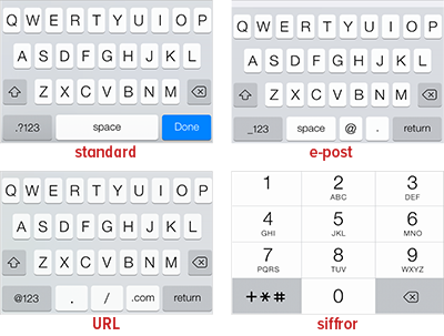
- Make sure that the user gets the right keyboard for the right purpose: text, numeric or e-mail mode and so on
- All clickable elements should be at least 44×44 pixels to reduce the risk of wrong clicking (“Rule of thumb”)
- Make sure to have a larger margin between fields (more air) and especially around the clickable elements
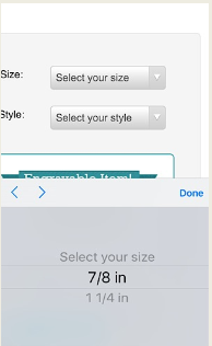
Note: refrain from using Apple’s standard drop downs on mobile phones, where it is very difficult to get the overview of the available options.
How do you know if you have a problem with your web forms?
To be able to analyse WHERE in your form your visitors drop off we strongly recommend to use form tracking. You can do it with the help of such tools as Formisimo or Hotjar and even tracking in Google Analytics and GTM.

This type of tracking gives an answer to WHAT happens.
But not to why.
To complete your quantitative data with insights on why the data looks the way it does, you will need to turn to qualitative data. You can use screen recordings, where you can see how the visitors react before and when leaving the form. Are thy looking for additional information where it cannot be found?
 Other qualitative methods include running a exit intent poll that asks the visitors why they leave without completing the form. You can even ask customer support about the usual questions they get from the visitors in a particular step.
If you have questions regarding web forms tracking or forms in general, we will be happy to help! Drop a line in the comment section below.